Dec 2025 Keyword Scouter.AI https://keywordscouter.ai/

Redesigning Keyword Scouter's Chrome Extension Dashboard

From a cluttered social monitoring tool to a focused lead-generation engine — making it easier to find, evaluate, and engage with high-intent conversations.

Project
KeywordScouter.ai
Scope
Chrome Extension + Web App
Role
UI UX Designer
Duration
4 Weeks
Keyword Scouter dashboard redesign

What is Keywordscouter.ai?

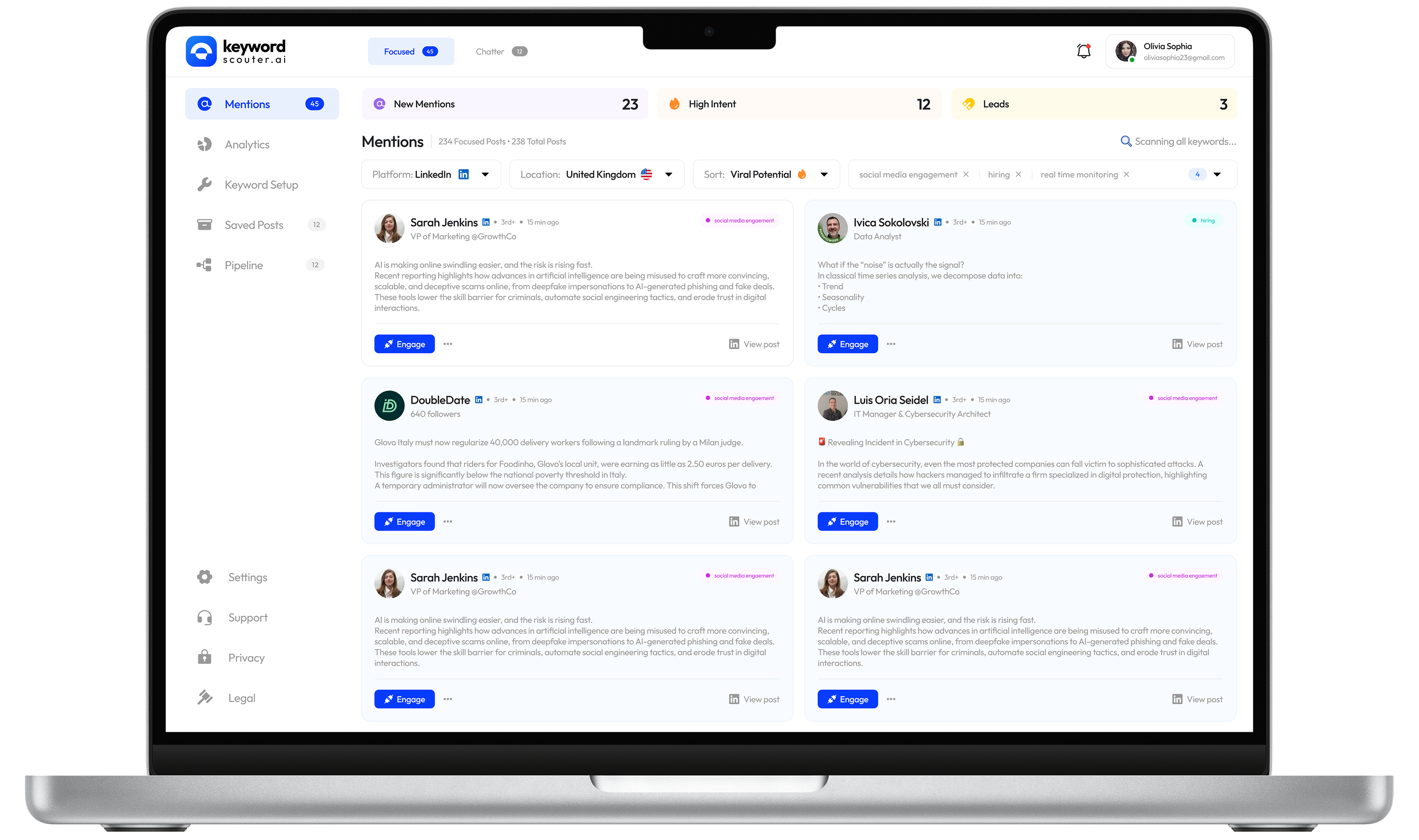
Keyword Scouter helps teams find high-intent conversations across LinkedIn, Reddit, and X.

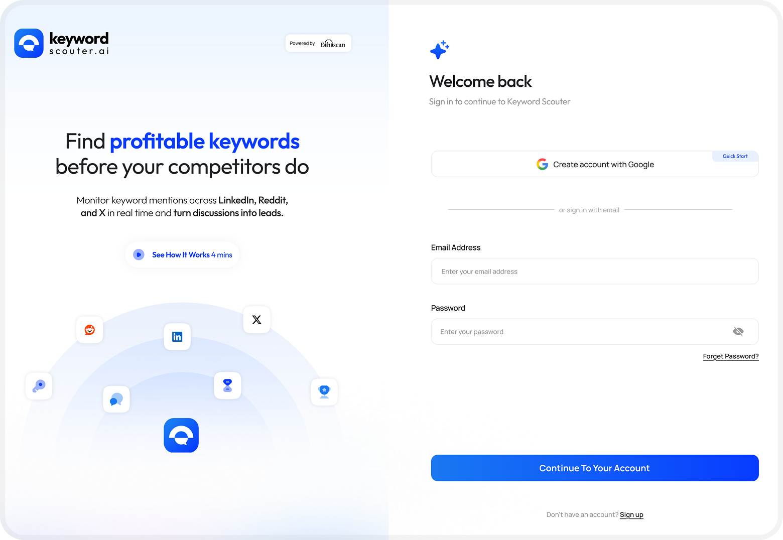
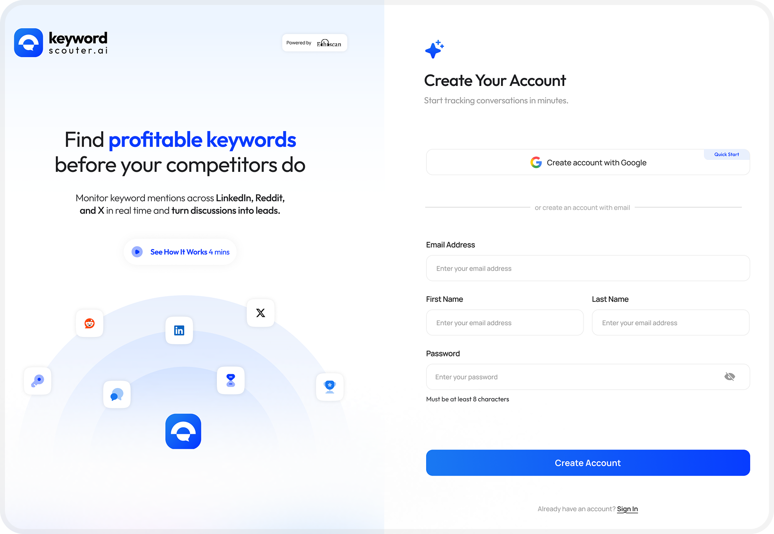
Keyword Scouter is a Chrome extension that monitors mentions of custom keywords across LinkedIn, Reddit, and X in real time. It helps growth marketers, founders, and sales teams discover high-intent conversations and turn them into leads before competitors do.

The product had strong core functionality — but the dashboard experience felt cluttered, the onboarding was heavy, and the engagement flow buried the most important actions. I took on the redesign challenge to simplify the interface while amplifying its lead-generation capabilities.

Onboarding
Install extension, pin to toolbar
Platform Setup
Connect LinkedIn, Reddit, X
Keyword Config
Define keyword to track
Mentions Feed
Browse and filter results
Engage
Comment, connect, or pipeline
12
Screens redesigned
10+
UX improvements identified
40%
Faster lead identification (estimated)
3+
New engagement actions per post

Four friction points slowing users down

After studying the existing interface across all five screens, I identified clear patterns of friction that were reducing the speed and confidence with which users could act on opportunities.

Overloaded navigation
Top navigation mixed contexts, making Focused vs Chatter unclear.
Engagement modal had no hierarchy
Comment and "Add to Pipeline" had equal emphasis, blurring the primary action.
Onboarding with too many steps
4 setup steps before platform connection caused early drop-off.
No signal for lead quality
Posts looked identical, hiding High Intent leads among general mentions.

Before & After

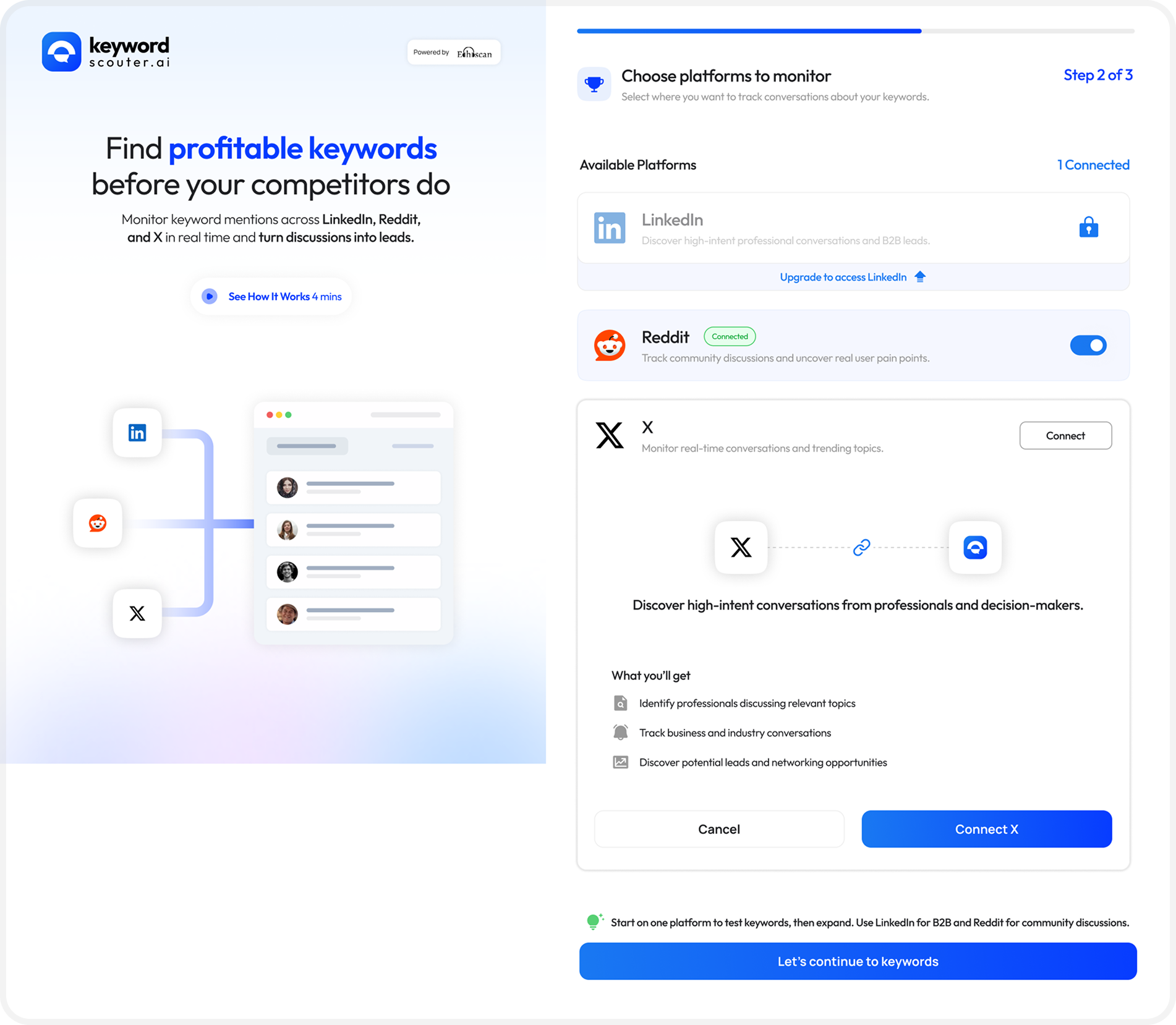
The redesign focused on three key screens: the mentions feed, the engagement modal, and the onboarding setup flow. Here's a direct comparison of what changed and why.

Mentions Feed
Mentions feed before and after redesign

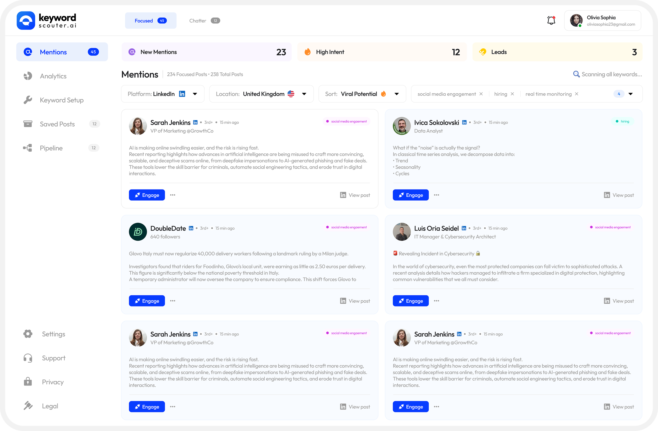
High-intent leads surface first with a coloured left border. Stats are scannable at a glance.

Added
Intent Score Strip
New Mentions / High Intent / Leads are now a persistent stat bar at the top, surfacing business value immediately on open.
Added
Left-border Accent
high-intent cards — amber border differentiates urgent opportunities from general mentions without disrupting card layout.
Improved
Card Hierarchy
Author name, role, and time are now visually tiered so users can scan the feed 40% faster.
Improved
Undifferentiated Filter Tags
Cluttered filter pills above cards were relocated to a collapsible filter drawer.
Engagement Modal
Engagement modal before
Engagement modal after

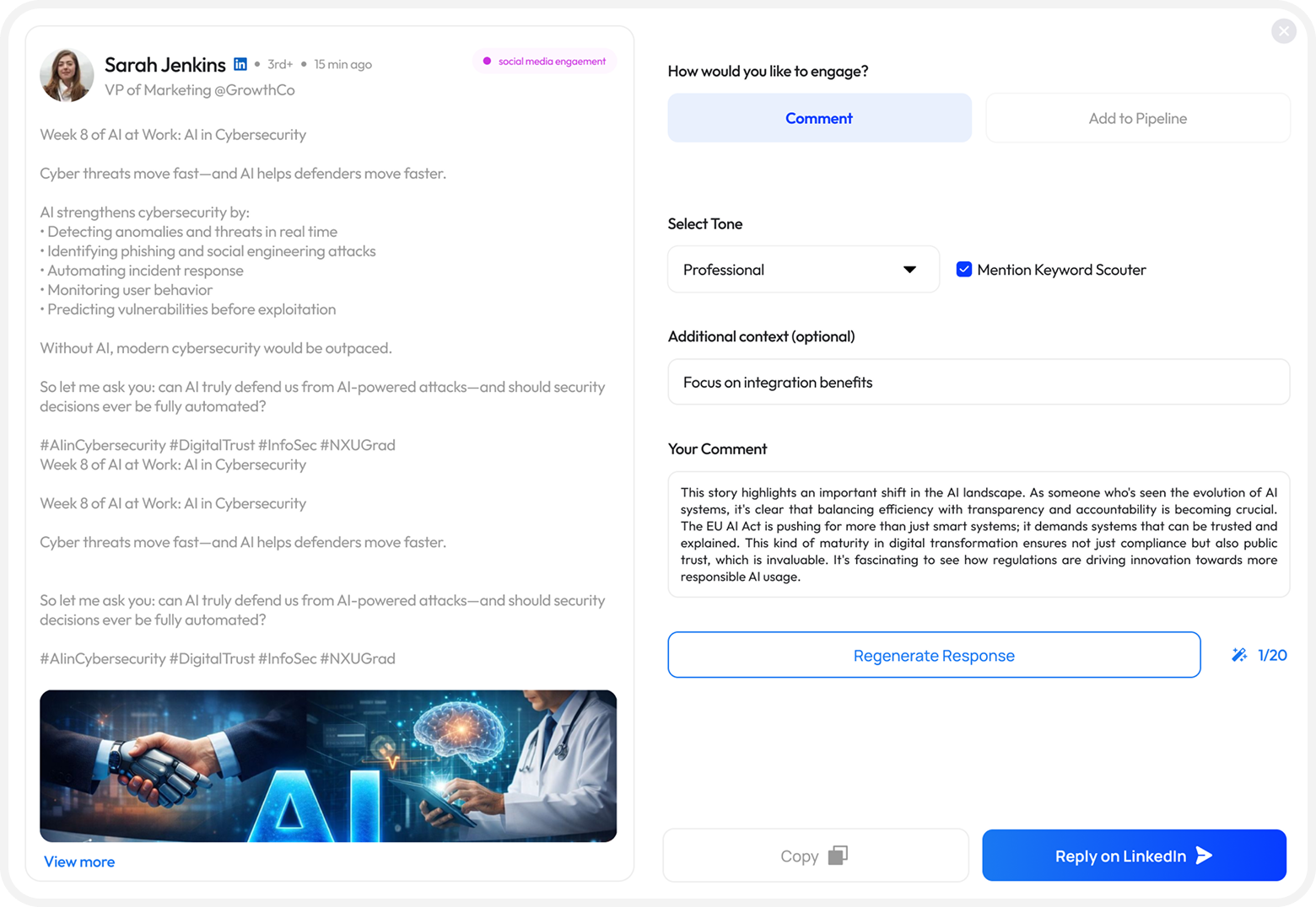
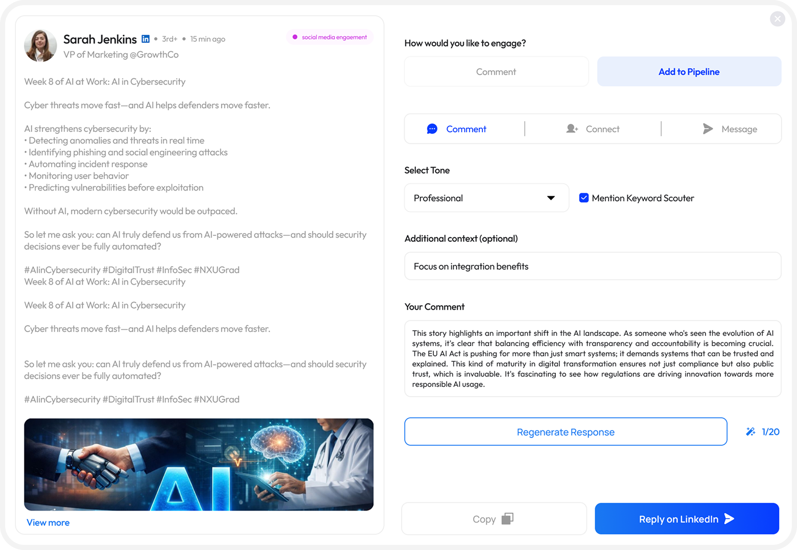
All 3 engagement types visible as tabs. Tone is a pill selector. Response counter added for context.

Improved
3-way Action Tab
Comment, Connect, and Message are all surfaced as equal tabs so users see every engagement path without additional clicks.
Improved
Tone as Pill Selector
Replaced the dropdown with a quick pill toggle (Professional / Casual / Expert) for faster switching.
Added
Response counter
Helps users understand they can regenerate and compare options before sending.
Improved
Mention Keyword Scouter checkbox
Removed a promotional checkbox from the compose UI that felt forced and reduced trust.
Onboarding Flow
Onboarding before
Onboarding after
Improved
4 step extension pinning instructions
The pin-the-extension walkthrough was collapsed into a single in-context tooltip, reducing visual noise before value is delivered.
Improved
Platform Selection Step
The platform cards now clearly show connection state (Connected / Upgrade / Connect button) and surface a contextual tip recommending which platform to start with.
Improved
X connection expanded state
When a user taps Connect on X, the card expands inline (no full-page redirect) with clear benefit bullets and a single CTA.
Added
Progress Indicator
A "Step 2 of 3" label with a linear progress bar at the top gives users orientation and reduces perceived setup length.

Key design decisions

Area Rejected approach Chosen approach & rationale
Lead prioritisation Separate "Leads" tab with its own feed Inline amber left-border on high-intent cards in the main feed keeps context, avoids tab-switching.
Engagement entry Full-page navigate to LinkedIn post Modal overlay with in-app AI comment generation reduces context-switching and keeps the user in the tool.
Tone selection Dropdown select element Pill toggle group — faster to change, options are always visible, matches the fast-paced engagement context.
Onboarding length Step-by-step screenshot guide for pinning Single in-context nudge — users who need help can expand it, others aren't slowed down.
Stats display Header counts only (small badges) Full-width stat strip with New / High Intent / Leads creates a dashboard feel and communicates pipeline health instantly.
Design showcase screen 1
Design showcase screen 2
Design showcase screen 3

A design system rooted in trust and clarity

Color Philosophy

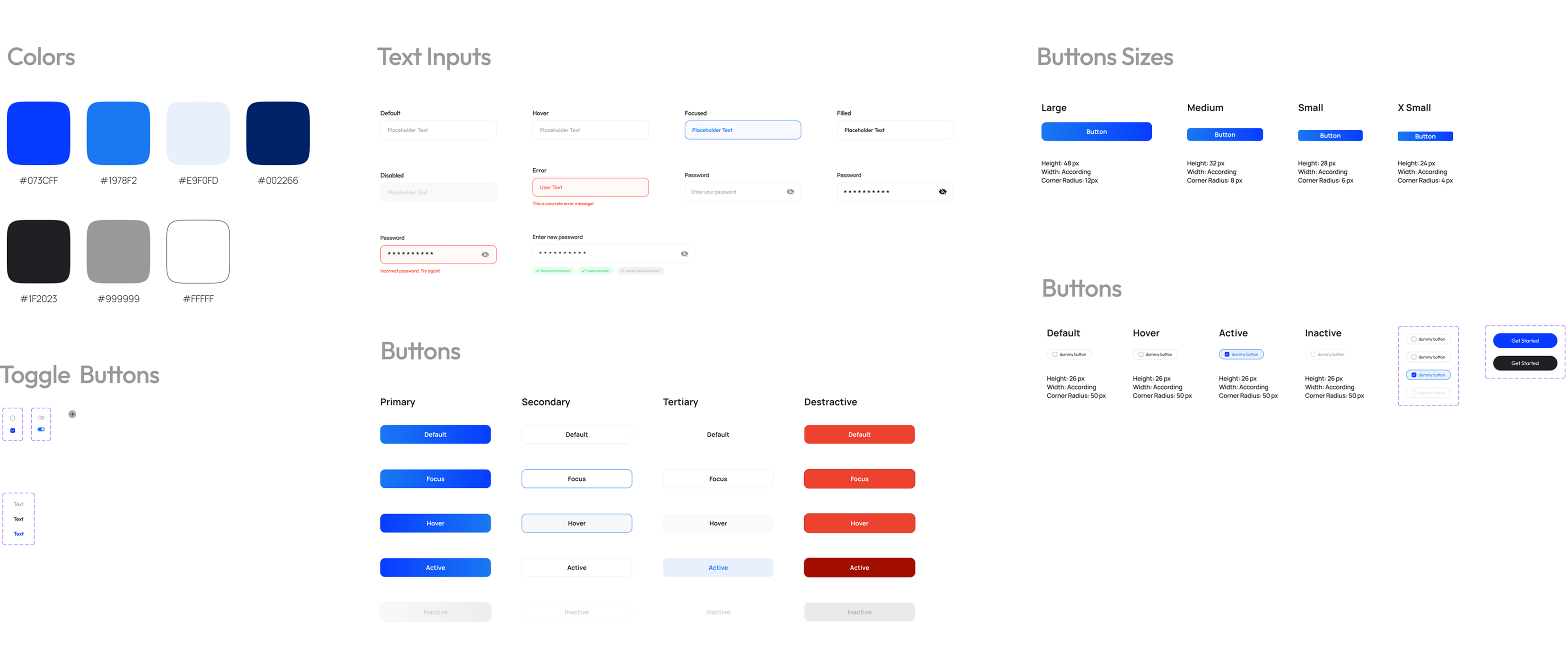
The color palette centres on a soft indigo-blue — conveying intelligence and reliability without the coldness of pure blue. White and light-grey backgrounds create breathing room, while the accent blue draws attention exclusively to CTAs.

#0073CF
#1978F2
#E5F0FD
#002266
#1F2023
#999999
#FFFFFF
Typography

A modern geometric sans-serif for UI text (clean, fast readability) paired with heavier display weights for headlines. The type scale follows a clear hierarchy — no ambiguity between headings, subheadings, body, and labels.

Aa Bb Cc 123
Heading — Semibold 700
Body — Regular 400 · 14–16px
LABEL — UPPERCASE 11PX

Estimated impact

The redesign focused on friction reduction and signal clarity. Based on UX heuristics and comparative benchmarks, the following improvements are expected from the updated flow.

~40%
Faster identification of high-intent leads in the mentions feed
3x
More engagement actions visible per post (Comment, Connect, Message)
↓60%
Reduction in onboarding steps before first value moment
↑UX
Clearer visual hierarchy across all three redesigned screens

How I approached the redesign

1
Audit & heuristic analysis
Walked through all five screens of the existing product, documenting every friction point against Nielsen's 10 usability heuristics. Created an annotated audit with severity scores.
2
Jobs to be done mapping
Identified three core jobs: "Help me find the right posts to engage with," "Help me respond fast and sound human," and "Don't slow me down before I see value." Every design decision was tested against these.
3
Lo-fi wireframing
Rapid sketching of the three core screens — Mentions Feed, Engagement Modal, and Onboarding — exploring multiple layout approaches before committing to a direction.
4
High-fidelity design
Built polished Figma mockups using the existing Keyword Scouter brand language — blue primary, clean card layout — while introducing new visual hierarchy elements like the intent stat strip and left-border signals.
5
Design rationale documentation
Each change was documented with a before/after comparison and a written rationale explaining what problem it solved and what trade-offs were considered.

What I learned along the way

01
Speed is the product
For a lead-gen tool, every interaction before "I found someone I should talk to" is a cost. The redesign focused on removing anything that delayed that moment.
02
Visual signals can replace words
An amber left border signaled priority on high-intent cards without extra labels or badges — efficient visual design communicates information instantly.
03
Modals can be a feature, not a fallback
A well-designed engagement modal keeps users in context while making replies easy to compose and send, with clear hierarchy to avoid feeling disruptive.
04
Onboarding length shapes first impressions permanently
Users who drop during onboarding never discover the product's value. Reducing the path to "first useful moment" is always worth prioritising over completeness of feature education.